Monday Videos

The videos went through Gestalt Theory. The first one is proximity, which is when different objects are placed together so that the audience thinks that they are a group. Similarity is next, which is when different objects are similar-looking, then the eye thinks that they are a group together. The next is continuance. Continuance is when the designer makes a line in their designs so that the eye the objects in a linear way. Lastly closure is when a design has missing elements and visuals, so our eyes fill in the rest. The second video is about organizing and ranking things in order of significance. In my special topics in communication media, we learned that this is called visual hierarchy. Using visual hierarchy the author of the visual can lead the audience to what is most important and how they want the audience to read the document.

While I was reading about these design elements, all I could think of was my special topics in communication media class, because we’ve learned about these visual strategies already, and it is very interesting to me. So I thought to myself “damn I gotta think of something”. I leaned back in my chair, looking around my dark room. It was about 11:20 pm, so I was a little pressed for time. I look behind me and looked over my favorite poster in my room. The poster is the Michael Jordan poster called “Wings” shown below. I realized that even this poster that featured hardly any writing had some of these elements. Take a look at the dope-ass poster below. I know it’s sick right?

Image result for michael jordan poster

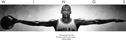
The first thing you notice is Michael in the middle, arms outstretched. That’s where the designer wanted you to look first. That is the top of the visual hierarchy. Next you notice the “Wings”. The Continuance makes you read it slowly, and because of the huge kearning between each of the letters, you feel the scale of the poster again, yet again looking at the length of Michael’s outstretched arms. Lastly, you notice the block at the bottom. Because it’s all the same font, size, boldness, all in italics, you group it together, reading it all at the same time. The proximity also makes you group it together. The visual hierarchy, is first Michael, then the “Wings” then the text at the bottom. I had never noticed those tiny details before, but reading this chapter has shown me those details.

Debbie Does Salad

Reading Summary

The article begins by introducing the reader to some of the realities behind filming in studio and specifically for a cooking show. The next part of the article gives a short introduction and explanation of Barbara Nitke and her career as a porn still photographer. From here the author and Nitke go on to give the parallels and similarities between porn films and Food Network shows. This section is ended by another close up on the process of Food Network production. The final part of this article is about the idea that the stomach can be considered the second brain of the body. That it controls many parts of the body that are not controlled by the brain. It is also emphasized that our second brain is what controls what we desire and thus is how many of these shows in food and porn make money off of people.

Outside Example

Something that came to mind after I finished reading this article was actually art. What reminded me of art was when the behind the scenes process of the cooking show was explained. In the show every detail is looked at planed and even insignificant aspects are given attention. Likewise, in made pieces of art even the smallest detail of a painting or drawing was intentionally placed. As a person who is watching or observing art or a show many of these things will never be noticed but they do contribute to how people’s view of them is formed.

Reading connection

In the article, it is discussed that our second brain or gut controls what gives us that ‘”WOW”‘ feel (Kaufman 60). That many of the decisions of the show are based off of this feeling because its what our gut craves and this WOW feeling makes them money. Somewhat similarly an artist will draw or paint in a way that they believe will pull in their audience will capture their attention or imagination.

“How Subarus Came to Be Seen as Cars for Lesbians,” Reading

Summary

In the 90’s, Subaru launched a marketing campaign targeting lesbians after finding a significant portion of their customers were lesbian women who felt the car fit their active lifestyles. At a time in which it was even more common for companies to not embrace or acknowledge LGBT people and issues, the decision was met with concern and backlash from the public. Despite this, Subaru felt committed to the project and began to advertise to lesbian audiences, primarily through campaigns coded with implicit references to gay culture (a strategy that reduced negative public reaction). Subaru also more openly supported LGBT issues by partnering with gay celebrities and charitable organizations. Subaru’s strategy seemed to pay off for them in terms of financial success and popularity. Subaru faced criticism from the LGBT community for only targeting gay people of privilege who were white and upper class, primarily for the sake of increasing the company’s profit as opposed to bringing about meaningful change to queer populations. Subaru dismissed these claims by saying their partnership with charities and overhaul of internal policies (offering employment benefits to those in same-sex relationships) were fundamentally progressive.

Outside Example

This article made me think of the discussion around “Pink Capitalism,” or how capitalism and corporations have co-opted the LGBT movement to create profitable new markets for queer people in a position of economic power, often under the guise of a progressive acceptance and embrace of sexual minorities. Examples include companies participating in pride parades, marketing campaigns targeted towards queer people, and the creation of LGBT tourism. Pink capitalism is often criticized for its failure to meaningfully address LGBT issues, and its tendency to push for conformity to a particular image of queerness that is predominantly white and affluent.

Reading Connection

Subaru’s strategy of targeting lesbian consumers, and the article’s portrayal of this strategy as “progressive,” can be viewed through a lens of pink capitalism. The company’s primary motive seemed to be increasing profit, rather than bringing about meaningful social change. The article even admits to how Subaru was ultimately reacting to a failure to increase sales through other marketing tactics, rather than the social issues faced by lesbians and LGBT people in the 90s. Each step Subaru took in procuring a lesbian market for their cars was carefully calculated for the sole purpose of increasing sales, from the revision of company policy to the selective use of coded messages.

How Subarus Came to Be Seen as Cars for Lesbians

Reading Summary:

This article talked about how Subaru changed its approach and started targeting lesbian audiences in their advertisements. This new approach came as a result of Subaru experiencing difficulty in trying to market their brand to a general audience of 18-35 year olds. The decision to target the lesbians wasn’t easy as it was challenging to get management on board with the idea and overall, the company received a lot of backlash in response to their decision. However, this hard decision paid off as their new approach became a huge success. Ultimately, the Subaru brand fit perfectly with lesbians and their active, low-key lifestyle. This decision came in a time where there wasn’t a lot of positive discussion toward the LGBT community. However, Subaru created a new trend as advertisements toward the LGBT community started to become more mainstream. 

Outside Example:

My outside example is a store called “Lefty’s, the Left Hand Store.” They have 2 stores in Florida and 1 in California. Lefty’s is unique because they make products specifically designed for left-handed people. From school supplies to kitchen sets, they strive to make everyday tasks easier for left-handed people. I’m right handed and I’ve never really thought about how difficult it is for lefties to use everyday objects. However, now that I think about it, I realize that it is the default for products to be made for right handed people. Even items like scissors and notebooks are designed for righties.

Reading Connection:

I found a connection between Subaru and the Lefty’s store because of the fact that they target such a specific audience. Similar to Subaru’s approach to advertise itself as a car meant for lesbians, Lefty’s also targets a minority population as only 10% of the world population is left handed. I think both of these brands are successful because the groups that they advertise towards are so used to being overlooked and treated as invisible. Also, this approach allows them to differentiate themselves from other brands that target a more basic audience. These groups really appreciate it when a brand advertise towards them and they end up becoming super supportive of these brands. Overall, I found a connection between these two companies because they separated their companies by targeting a disregarded population and found success in marketing towards these audiences. 

How Subarus Came to Be Seen as Cars for Lesbians

Summary

This article discussed how the Subaru car company used targetted advertising to market their cars. When they began to look at demographics that were buying their cars, lesbians were one of the main groups identified. They openly marketed and sold to a lesbian/gay market when it wasn’t popular to do so and reformed policies within their own companies to match the ideals they were trying to sell. The company figured out subtle marketing strategies that appealed to both their lesbian/gay audience but also their more conservative audience. Their successful marketing toward a stigmatized group was less about curating an image and, instead, was an acknowledgement and support of their customers.

Example

While reading this article, it made me think about the controversy over companies advertising and participation during pride month and pride parades. Companies will put out LGBTQ advertisements and have floats in pride parades. However, many people have become annoyed at this because it takes away the meaning of pride and is taking advantage of their demographic. Some of the companies that advertise during pride only do so because it will bring in money, but they don’t actually support the LGBTQ community, and so are using pride purely as a marketing scheme. This has made many people who are part of, and support, the LGBTQ community mad because of the disrespect they feel is happening by advertising to a group that a company is actively spending money to suppress.

Connection

Comanies that advertise during pride month often are called out because they are obviously using it as a chance to gain publicity. Also, many times it is a product that does not have a significant LGBT demographic that would warrant such specific advertisments. This is in direct contrast to how Subaru marketed towad their lesbian community. They were identified as an already existing, major demographic, so advertising to them made sense. Subaru also changed their company policies to reflect the messages they were advertising, but many of the companies and organizations that advertise during pride month don’t do the same.

Blog Post #4 for 2/10/20

Reading Summary

The video “Creating visual hierarchy with type” is a step-by-step example of how using visual hierarchy can help creating an organized and easy to follow layout. At the beginning of the video we see a lot of text with the same font and size. As the video progresses we see changes done in fonts and sizing to separate different meal types and then split up the name of the dishes and their description. In the end of the video it is easy to follow the menu because all the texts are in different fonts and sizes and the spacing makes it easy to go down the page. In the video “Using gestalt theory to guide layout” we review the four principles of Gesalt Theory proximity, closure, similarity, and continuity. We then we see how these principles are used on a template of a website. We also see example of how the rule of threes applied in their example and how all of these principles and elements are used together . The person that created the video also experiments with different layouts to show that there isn’t only one correct way to use these principles.

Outside Example

In high school I took a basic programming class where we used html, css, and other programming languages to understand the way computers worked and the way we need to write code so that computers do what we ask them to do. We learned a lot about the origins of the computer and we even took a field trip to the Computer History Museum where we saw many types of computers and how they have improved throughout the years. We had a few projects like making a website, creating a simple game, and a short video but they took a while to complete so the class was mainly focused on these projects. Although it was a good class to take, I would have preferred if we had focused on common programming languages such as java or python rather than making a video game in a program similar to scratch.

Reading Connection

Watching the video “Using gestalt theory to guide layout” reminded me of a project in that class where we used html to make a website on anything we wanted. I did a website about a video game that was releasing soon and I was very excited about playing .I decided to make the website similar to a wiki about the characters, maps, and weapons from the game that had been revealed. Although I put in a lot of effort into the project, my website design was really bad and did not look anything similar to the website layout from the video. I also did not use many of the principles or elements from both videos. I had a lot of different text fonts, different colors, and pictures all over the place. In the video, everything such as the images and subheadings were organized, neat, and easy to follow.

Monday, Feb.10: Videos

SUMMARY

The first video touched on Gestalt Theory, and how layouts are designed using this specific theory. The first part of the theory is proximity. This idea means that things that are grouped in the same general area have the same functions. Similarity is the second part of the theory, meaning things that are grouped by colors, shapes or fonts go together. For example, text against a white background goes together and texts against a yellow background go together. The third part is continuity, meaning things are grouped in order by a visible/implied line of sight that lead you to the next part of the website/advertisement. Lastly, closure is the idea that when half or a portion of an image is finished, the brain finishes the rest of it on its own. For example, including half a picture of an air balloon in a header might seem strange, but an individual’s brain will finish the photo on its own.

The second video explains the significance and importance of organizing a document to show what is most important, as well as correctly grouping different things together. By doing this, the designer can highlight what needs to be most important to the audience and how the document is supposed to be read.

OUTSIDE EXAMPLE

When going to a restaurant, there’s an unspoken expectation of how a menu is supposed to be set up and read. It starts with appetizers, then entrees (often organized by the type of food: chicken, pasta, pizza), desserts, and then followed by drinks. This follows the chronological order that someone would eat their meal in: appetizer, main course, then dessert.

Right next to my house, about 30 minutes from here, there is a small family-run restaurant called “Wraptitude”. This tiny place sells wraps, burgers, mexican food, and really fun desserts. Although the food is fantastic, when we first started going it seemed quite disorganized. I would mainly attribute this to the menu’s lack of order. The appetizers were on one of the last pages, drinks first, desserts scattered throughout as just simply images on the side of the page.

It doesn’t seem like a big deal, but it definitely made a big impact on our first few experiences there. Although the service and food were both great, just this simple issue made the whole restaurant seem like it had opened 2 days ago.

CONNECTION

When looking back on this experience after watching the video about visual hierarchy, this explained the strange feeling we had when we left. If a document (in this case a menu) isn’t designed properly, it can have a different effect on an audience, sometimes even a negative impact. The idea behind visual hierarchy and the design that goes into menus as well as other important documents should be prioritized in the process of starting a new business.

Image result for wraptitude san antonio tx

How Subarus Came to Be Seen as Cars for Lesbians

Summary:

The article discusses how Subaru’s attempt at picking up their sales by focusing their sales at five core groups: teachers and educators, healthcare and IT professionals, outdoorsy types, and lesbians. They found that among lesbians, “there was such an alignment of feeling, like [Subaru cars] fit with what they did”, noted by how they were good for outdoor trips, as well as could haul things without being as large as an SUV or pickup. Because of this, Subaru focused on ads targeting these specific groups and in particular noted how “playful coding” of certain meanings or images within the advertisements was preferred by the lesbian and LGBTQ community as a whole.

Outside Example:

In 2017 Pepsi released an advertisement depicting a group of protesters moving through the streets. The ad also features Kendall Jenner who joins the protesters after removing her blonde wig. As she moves through the crowd, everyone is greeting her with smiles and fist bumps until she approaches the line of stern faced officers. A photographer in the background, seeing the tension between the crowd and the officers rise, prepares to take a picture of a possible clash. However, Kendall Jenner steps to the front of the crowd and breaks formation to hand one of the officers a Pepsi, which ultimately leads to a celebration within the crowd and smiles from the officers that deescalates the situation.

Connection:

The problem with this ad was that at the time of its release, there were many protests underway within America of the #BlackLivesMatter movement. The ad was criticized for its shallow view of what the movement stood for and how it undermined the entire point of the movement itself. Looking back at the difference of how Subaru marketed their cars, they took careful consideration into coding their ads so that whether they were viewed by the average consumer or by their target audience, they were viewed in a positive light. Furthermore, Subaru also went out of its way and donated to charities that aimed to combat HIV/AIDS. Alternatively, Pepsi tried taking advantage of the circumstances as it wanted to cast itself in a positive light among consumers, as if it was a magical elixir that mended both sides of the #BlackLivesMatter movement together.

How Subarus Came to Be Seen as Cars for Lesbians

Summary:

Subaru of America was having a difficult time fighting other car companies for the demographic of white 18-35 year olds, so they decided to change their target buyers. They identified five groups of people: educators, health-care professionals, IT professionals, outdoorsy types, and lesbians. Each group has their own respective reasons for preferring a Subaru. For the lesbian niche, they felt as though the car perfectly fit their needs and was not too flashy. Subaru really embraced their lesbian stereotype and it was a great success for the company as well as a step in the right direction for the LGBTQ+ movement. However, this was not an easy process, as there was still great hesitation for companies to endorse the idea of being gay. Subaru knew that if they wanted to market to the gay community, they would also have to support their gay and lesbian employees by giving them domestic partnership benefits. By 1996, the ads were appearing in both mainstream media and gay publications. There was some black lash and people threatening to boycott. However, these people were never customers in the first place. Subaru figured out that their gay audience preferred more subdued marketing towards the LGBTQ+ community. This is known as “gay vague.” These new gay friendly advertisement turned into great success for the company and it grew at a very rapid pace. Subaru not only marketed towards the LGBTQ+ niche, but also supported causes that they care about, such as HIV/AIDS research. This urged other companies to put in place more gay-friendly policies for their employees.

Personal example:

I had to brainstorm to think about brands that have a specific target audience, but I think that just about every company does, even if you don’t notice it. I chose this Clif Bar commercial. Clearly, Clif Bar is trying to market to an outdoorsy audience. However, I am always very skeptical of commercials like these because I know that eating a Clif Bar is not going to make me a better hiker or immediately transport me to a mountain.

Connection to Reading:

It is obvious from the first couple of video clips that we see in this commercial that Clif Bar is marketing to the outdoorsy type. They are also trying to create the image of a health-conscious brand that supports athletes and adrenaline junkies on their adventures. They have identified their target audience and give those people what they want to see and what they want to hear. I searched their website and they claim to “strive for a healthier, more sustainable world.” This also seems to cater to the “hippie/granola” type, who want to leave a smaller carbon footprint. According to an online source, Clif Bar has grown 18% in the past 10 years so it would seem that their marketing tactics are successful.

Subarus and Lesbians

Reading Summary

According to The Atlantic, Subarus were popularly marketed toward lesbians. In the 1990’s Subaru was trying to compete with some of the leading car sellers, but could not compete in that market. So, Subaru did a study to find who its main market was. They found a fifth core group that purchased Subarus, lesbians. During the nineties they could not directly market towards lesbians because they were not as widely accepted as they are today. The reason that Subarus appealed to the lesbian demographic is because of their low-key life style and appearance. They were versatile like a truck but not as flashy and this appealed to lesbians. So, despite the possible backlash Subaru pushed a lesbian marketing campaign and it was wildly successful, thus making Subarus the “lesbian car”. Some people began to boycott businesses that supported and others sent in threats, but none of this stopped Subaru with the campaign.

Outside Example

This reading reminded me of when people began to boycott Chick-fil-a. Last year people were boycotting Chick-fil-a because of their support of a Christian organization and their stance in regards to the LGBTQ community. Many withdrew from purchasing their food and even protesting it. Even on our campus we almost had Chick-fil-a removed from Coates because of the controversy behind it. Ultimately, Chick-fil-a was not removed from Coates, but they did stop their funding to that organization because of the negative publicity. As long as I still get to eat Chick-fil-a, I am happy.

Reading Connection

The Chick-fil-a protests and the Subaru protests are similar but opposite at the same time. Both companies recieved backlash because of their support of certain beliefs. Chick-fil-a received backlash due to their support of a community that does not support LGBTQ. Subaru received backlash due to their support of the LGBTQ community. Neither company went out of business or were seriously hurt, but the attention from media in both instances is prominent. The support of these companies is also juxtaposed with each other. Although the backlash was similar, the things they were supporting were completely opposite perspectives.

Design a site like this with WordPress.com
Get started