Reading Summary
Together, these excerpts explored the construction of advertisements through breaking down their meaning with semiotics. Semiotics is a multiple meaning understanding specific to the viewer and their translation. In order to complete this deconstruction of advertisements, the authors focused on the “connotative chain” (Danesi, 47). The connotative chain was simply a continuous word chain of words, concepts, ideas, and visuals seen in an advertisement and how they flowed into a singular main idea at the end of the summarized meaning. An important aspect of this article to consider is that like semiotics, these connotative chains are also open to interpretation. Therefore, there may be multiple connotative chains with different conclusive ideas for the same advertisement. All aspects of semiotics belong in the creation of advertisements and are what is being interpreted in these connotative chain. The goal of all advertisements is to make it recognizable in some aspect to the viewer so that whenever they are introduced to an advertisement they immediately recognize a part that connects them to a product.
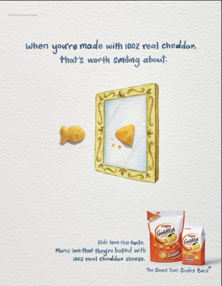
Outside Example
With the focus on creating a recognizable advertisement, the goldfish advertisement came immediately to my mind. Through symbols, slogans, signs, colors and sounds; the creators of Goldfish ads whether through film or image have produced a product that is easily recognizable and known to all viewers. Every ad contains the goldfish symbol and their slogan “the snack that smiles back” either voiced through video or written on the ad. The ad below takes a more simplistic turn compared to majority of their vibrant, animated ads but is still recognizable in advertising Goldfish through their symbol, slogan, and package.
Connection to Reading
Like Danesi’s reading, there are many components that go into conveying a singular message in an ad. This particular add is unique in comparison to other Goldfish ads adding to why it stands out and leaves an impression. This add focuses more on the natural ingredients used to make Goldfish targeting mothers directly who are most likely to buy this for their children. The background is limited in color and the ad itself is compromised of 3 colors, white, orange, and blue. Orange and blue compliment each other, not to mention the additional calming presence of blue to compliment the idea of a nurturing mother. This is just one interpretation of the advertisement but nonetheless is recognizable and leaves an impression with the repetitive features of the goldfish and slogan.

check plus
LikeLike