Summary
In the first video, “Creating Visual Hierarchy with Type”, it explains the importance of visual hierarchy, and how it is vital when one is creating a sense of order on a graphic. By the use of typography and appropriate space, a designer can decide how to place the important information in the perfect position. For example, if someone wants to emphasize the name/title, making the font and text size bigger allows audiences to see what the main selling point is. Another tip from the video was to add space in between text so that the words don’t seem squished together which makes it harder to read. Similarly, the second video, “Using the Gestalt Theory to Guide Layout”, emphasizes the four Gestalt theories and how they are used in graphic design. The four theories are proximity, similarity, continuity, and closure. In this case, proximity is described when items that belong together should be placed/grouped together in order to have a balanced image. Similarity is defined when things certain objects look alike and should therefore be related in some way. Continuity involves flow, which means a line is typically pointing from one place to another according to how the graphic layout. Finally, closure is the tool that humans use to fill in the blanks for missing visuals and points. Our eyes tend to see both negative and positive space when we are observing an image.
Outside Example
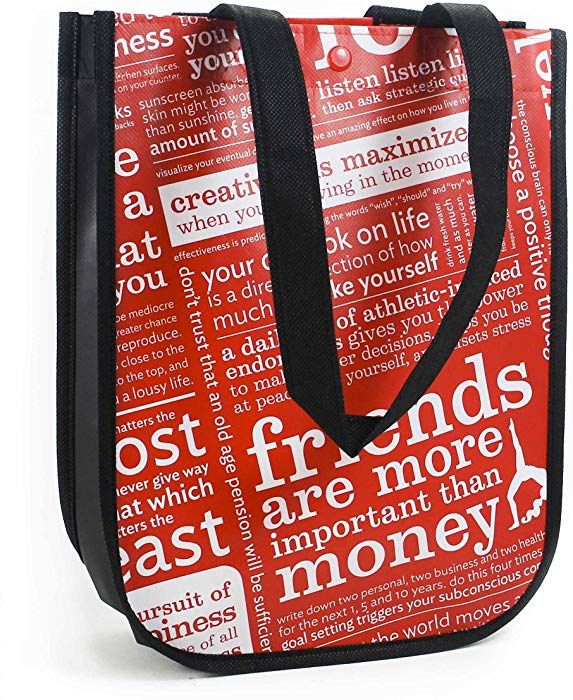
At first, I thought that all of this basic terminology about fonts and bolder texts made sense to me because it was so obvious in my perspective, but when I was thinking of my connection all I could think about was Lululemon’s logo. The company has vert unique style bags that they give out to customers when they purchase items and at first glance, it just looks like a bunch of words jumbled up together. However, this was part of their branding strategy. They compressed a bunch of words like yoga, friends, love, creativity, choice, etc. to show what their company is built on. You can see in the image bellow that some words are bigger than others which indicates the importance of that word or phrase. I think this was a clever way to have creative style as well as the graphic strategies to make this company more and more successful.
Connection
The Lululemon bag follows the rules of the first video, in that it emphasizes bold fonts and large size texts to show importance in a graphic. The Lulu bag consists of very small fonts and really large ones as well which was designed to make the audience see the main ideas. The small, condensed texts, however, goes against the theory of proximity and similarity. The layout of this bag does not follow the rule of proximity because the worlds are very close together and the images and phrases are randomly placed on the bag. The similarity law is also broken because not all images/phrases on this bag are related in a specific way; they are all crunched up. While this graphic goes against some of Gestalt’s theories, the bags are still creative and catches the eye of consumers as shown through the success the Lululemon company itself.

check plus
LikeLike