Reading Summary
Chapter 6 focuses on the concept of a grid for graphic design. The reading emphasizes the importance of a grid as an organizational tool. To define it, “a grid is a series of horizontal and vertical lines charting out an area” (pg 58). The first and most useful step of grids comes when one thinks of the location of the focal point. The grid helps the creator find the best and correct space for everything. The chapter also goes into detail on how to create your own grid which is helpful if you have a different sized paper. Moreover, the reading discusses alternative techniques such as ‘breaking the grid’ as an example to show how to arrange the information in a different way if you want to evoke emotion or to simply break away from the general grid.
Chapter 7 discusses the layout of visuals and text and how they work with grids. The chapter first introduces the reader to the idea of a focal point and where to locate it. Some examples like ‘The Golden Proportion’ and ‘The Rule of Thirds’ are used to show that the focal point can be placed in different places and still catch the audience. Also, the reading discusses the Gestalt of proximity, similarity, continuity and closure to help the flow of the text and the visuals.
Finally, chapter 8 discusses type which in media means: the words typed onto the document. The chapter goes over some of the different styles of fonts available to users and how each font is seen and should be used for different purposes. Although one can use the font we desire or stick to Times News Roman, the reading discusses that for headings or titles one should use a bold, decorative, and different font than that of the text body. However, the text body should has a more simple and readable font since it is the longest piece of text in the document. The chapter goes on to explain the use of different techniques to emphasize a part of the text, to organize longer and shorter texts, and to make the whole text visually appealing to individuals.
Outside Example
As I was reading these chapters, the first thing that popped into my mind was instagram stories because they are composed through the use of grids, layout and type. Although the amount it takes to create an instagram story is not as long as that of creating a newspaper, they still share a similar process of organization with the ultimate purpose of appealing to an audience. So when it comes to an instagram story, we (at least I do) think about the location of our focal point, which tends to be us, and how it is positioned. Then, we follow up by adding a caption to it which instagram has provided multiple fonts and colors for or you can just write on it with your finger! Then, we like to also add some ‘stickers’ that we can move around to where we feel looks best. Finally, once we decide on the perfect pose, location and font of the text and stickers, we decide to post for people to view with the intend of them liking it.
Connection
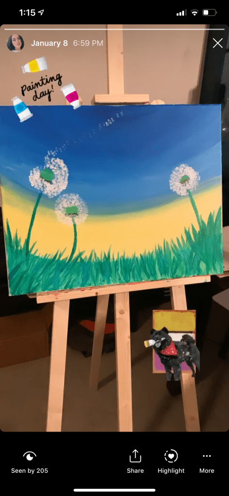
In my example, you can find a lot of the techniques suggested by the reading to create an aesthetic piece. For example, you can clearly notice that the focal point is the painting because it is right in the middle and it takes up the most space. Just like the reading said, the focal point needs to catch the attention of the audience which is what I tried to do by getting closer to it when taking the picture. Once I felt satisfied with the position of the painting, I moved on to the ‘negative space’ surrounding the painting. I knew the painting was pretty but not enough to stand on its own. So I added the text ‘painting day.’ This part is what took me the most time because I didn’t just need to decipher what to write but I also needed to decide if I was going to type it and if I did, what font would look more appealing? What should the size of the font be? and its placement which chapter 8 discusses and offers suggestions for. Yet, I didn’t have any knowledge on this when I was posting that story so I just went by what I thought would be most appealing and went for the sticker that said ‘painting day’ with paint around it because it looked cute and eye-catching. Yet, I had to make it smaller so that it wouldn’t obstruct the sight of the focal point, the painting. Again, the reading talked about how the size of the font matters especially if you want it to guide the eyes of the reader elsewhere. After adding that sticker, I still felt that there was a lot of empty or ‘negative’ space in the bottom of the picture so I decided to add another sticker. Now that I have read the chapters and see this picture again, I don’t think I made the smartest choice adding the sticker of the dog because it looks a bit odd. I believe that the size of the dog could have been a bit bigger or changed to another sticker that fit the setting of the painting would’ve been better to create a cohesive look like chapter 7 talked about. Yet, I believe the layout of all the objects in the picture are good because they have a diagonal look and it leads the reader from up to down which is one of the most important steps that the reading discusses.
The reading made me realize that grids, layouts, and types are all around us and we even take part in using them but we don’t even realize it.

check plus, great blog presentation today!
LikeLike